Good evening StockBandits!
Last week’s breakouts to end Q1 came ahead of a 3-day weekend and were only incremental, placing great importance on the bulls’ ability to produce follow through this week to validate those breakouts. [Read more…]
Swing Trading and momentum investing stock pick newsletter and swing trading service.
By Jeff White Filed Under: Nightly Reports
Good evening StockBandits!
Last week’s breakouts to end Q1 came ahead of a 3-day weekend and were only incremental, placing great importance on the bulls’ ability to produce follow through this week to validate those breakouts. [Read more…]
By Jeff White Filed Under: Nightly Reports
Happy Easter StockBandits!
The major indexes were able to post new 52-week highs by the end of last week, despite some choppy price action for much of the 4-day week. [Read more…]
By Jeff White Filed Under: Index Charts
Last week, traders had just 4 days to get it done, and by the end of the week we had minor breakouts to new highs in all 3 of the major averages. The one curious piece of the puzzle is the index that has led the way higher since November isn’t joining the others – should we be concerned?
As we head into a new week of trading, it’s time once again to take a look at the indexes and the key levels they’re dealing with. This will impact how individual names move, so it’s where every new trading week begins.
Hit the gear icon on the player to select HD and then go full-screen for best quality.
Run time is 5:47.
Trade Like a Bandit!
Jeff White
Take a trial to our Stock Pick Service to get our trades.
By Jeff White Filed Under: Q&A
I was asked this past week why AAPL looked to be above a downtrend line on one chart but beneath the same downtrend line on another. Great question!
The short answer is that the scaling is different on the two charts.
You might have seen the words ‘arithmetic’ and ‘logarithmic’ in your charting program or your trading platform and wondered what they were. Aside from fancy words you might want to throw around at your next cocktail party, they’re really just references to the spacing of price on your charts. Arithmetic charts depict price moves in equally fixed increments, whereas logarithmic charts depict percentage moves in equally fixed increments. There’s more to them than that, but for the purpose of this post, that’s the grass-roots difference. (For a much more in-depth explanation, here’s a video from the Khan Academy.)
Who, you might ask, would use one over the other? I’m glad you asked! Generally, longer-term traders and investors prefer logarithmic charts as they’re wanting to see percentage moves to scale. And typically you’ll find that shorter-term traders prefer arithmetic charts as they want to see similar $ moves to scale.
What’s so interesting is that even though the same prices are being plotted on a chart, it can give you a bit of a funky comparison when looking at one vs. another. At the top of this post I mentioned AAPL in relation to its downtrend line. It’s now above that trend line on both arithmetic and logarithmic charts, so I’ve clipped back the chart a few days for the purpose of this example.
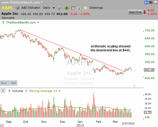
On the arithmetic chart, AAPL cleared its downtrend line on March 18 as it cleared the $445 level (which I happened to highlight the night before for members).
On the logarithmic chart, however, AAPL remained beneath its primary downtrend line until it cleared the $458 level on March 22.
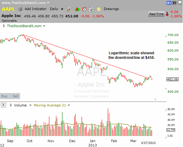
These two charts highlight very distinct differences even for a very basic trend line crossing. The arithmetic scale provided an earlier entry in price ($13) in this case, whereas the logarithmic scale required more time before price appeared to be on the move. To a swing trader like me utilizing trend lines frequently, that’s a significant difference.
Decide what’s best for you, and understand which of the two are most relevant to your trading style and timeframe.
Trade Like a Bandit!
Jeff White
Take a trial to our Stock Pick Service to get our trades.
By Jeff White Filed Under: Nightly Reports
Good evening StockBandits!
The S&P 500 is on a new streak – not the kind of consecutive advances or declines, but a streak of consecutive days with closes on different sides of flat from the previous session. [Read more…]
By Jeff White Filed Under: Nightly Reports
Good evening StockBandits!
The S&P 500 finished with a different color bar than the previous session for the 5th straight session today, jumping back with a solid gain after a decline Monday to challenge the high. [Read more…]
By Jeff White Filed Under: Q&A
The 50-period moving average is one often used by traders. In fact, simply applying a moving average to a chart will in some programs even default to a 50-period, and it’s one you’ll find on the charts depicted in many trading books and magazines.
It’s clearly popular, but is it relevant?
Maybe.
My take on moving averages is that they should only be applied when a trend is present, should only be relied upon as confirmation of what you should already be seeing in price, and that they should be customized to fit the pace of the existing trend. After all, that’s what a moving average is showing you – the pace of the trend.
What I mean by that is that a stock that’s accelerating higher with exceptional momentum should have a different period moving average than the steady-as-she-goes creeper of a stock. Generally speaking, the hotter the pace of the trend, the smaller should be the period of the MA. Likewise, the slower the pace of the trend, the more useful a longer-period moving average will be. Read this paragraph again slowly before you proceed! Too many traders think there’s magic in a moving average, but it’s simply something to reflect the pace of the trend, whether it’s a 50-period, a 13-period or any other number.
So there’s the explanation of it. Let’s get to what matters: some examples.
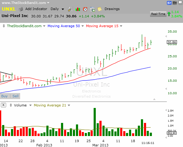
Up first is UNXL, which has been moving higher at a very rapid pace to put it mildly. The 50-day MA (shown in blue) is nowhere close to price, and therefore is completely irrelevant. Perhaps it was useful pack in late January, but keep in mind that as the trend accelerates in pace, the slower moving averages will simply get left behind and no longer matter. In this case, the 15-day MA (shown in red) has been keeping the recent pace of the trend. The stock is trending with great momentum, and a shorter period moving average is far more useful right now.
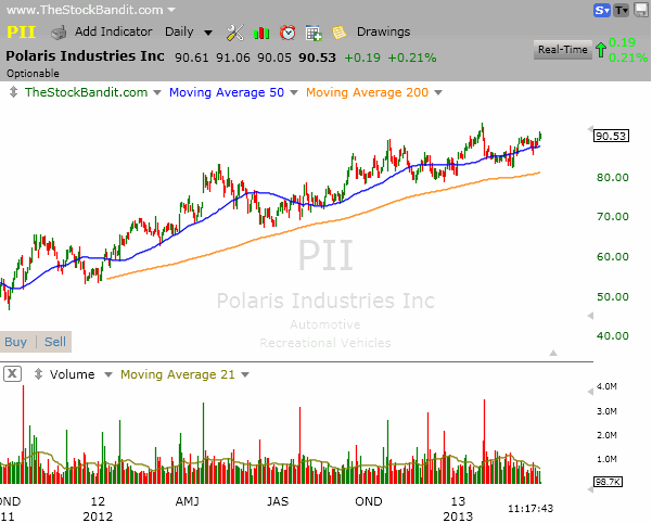
Up next is PII, which has been moving at a really slow pace. This is your grandfather’s uptrend, and the 200-day MA (shown in orange) is more useful here because it more closely tracks the pace of the trend. It’s a period that has been respected multiple times in recent months, whereas the (blue) 50-day has been totally ignored numerous times by price – it’s irrelevant because the pace of this trend is slower.
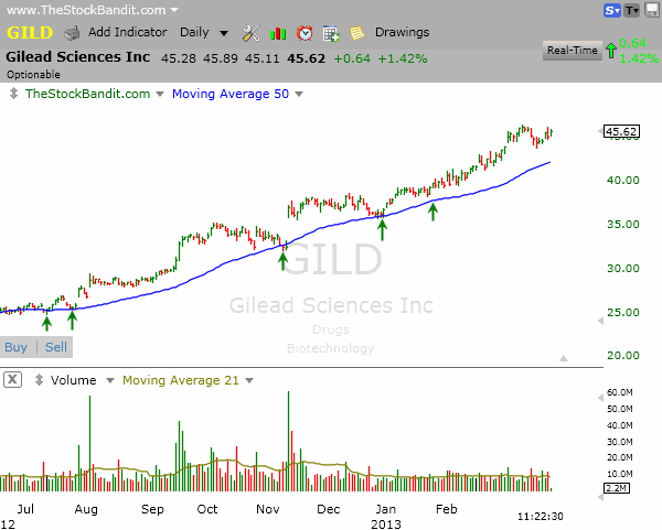
GILD, on the other hand has been respecting the 50-day for some time now. Pullbacks to that area have proven to be good entries on the long side. Although it still guarantees nothing going forward, the 50-day has proven useful for many months in this particular stock.
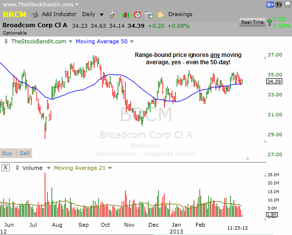
Finally, remember that all stocks will completely ignore ANY moving average when price gets caught in a trading range, so no moving average is relevant when that is the case. Pull them off your charts when that is the case! Here’s a look at BRCM and look at how frequently the 50-day MA was ignored as price zigged and zagged across it in recent months:
Here’s the bottom line: the 50-day MA might or might not be useful. Far too many traders leave it on their chart indefinitely and give it undue credit in too many cases. As price approaches it, they say “well there’s the 50-day so this is a good setup” and they don’t even stop to examine whether the 50-day MA has even been relevant recently. Don’t make that senseless mistake!
Instead of applying it (or any other fixed moving average) to every chart you examine, why not create a custom-made indicator for the trends you’re looking at? Maybe a faster MA will be more useful, or maybe a slower one. Just don’t get tied to one fixed-pace moving average and decide it’s the be-all, end-all solution for your trading, because that simply is not the case. Be more creative than that! Fiddle with the period until you get something useful!
If this is over your head and you need the 101 on technical analysis, don’t worry. That is the kind of thing we teach in our Basic Course, and you need to be in that course if you need more help understanding the charts or the fundamentals of trading.
Trade Like a Bandit!
Jeff White
Take a trial to our Stock Pick Service to get our trades.
By Jeff White Filed Under: Nightly Reports
Good evening StockBandits!
Pre-weekend hype centered around a Cyprus bailout ahead of the deadline, and on Sunday evening here in the U.S. we saw the futures express relief that a deal had been reached. [Read more…]
By Jeff White Filed Under: Nightly Reports
Good evening StockBandits!
The market essentially churned last week with a mixture of advances and declines as traders dealt with concerns over Europe/Cyprus along with the enthusiasm that comes with a market sitting at multi-year (or in some cases all-time) highs. Ultimately, every one of the indexes finished with single-digit net changes from the previous week, so there really was not much taking place. [Read more…]